Red Alerts in Israel – An Interactive Map
This interactive map visualizes historical Red Alert warnings across Israel. Each circle represents a locality where an alert was triggered. Color encodes daily alert frequency, and circle size reflects population. The analytical focus is the combination of these two variables. Only by viewing alert count and population together does the system reveal overall exposure patterns — insights that would be missed if each were considered in isolation. The timeline enables exploration of how these patterns evolve geographically over time. The visualization highlights geospatial patterns of rocket alerts over time, enabling exploration of frequency, distribution, and population impact.
Explore the rocket alerts visualization: Red Alerts and source on Github
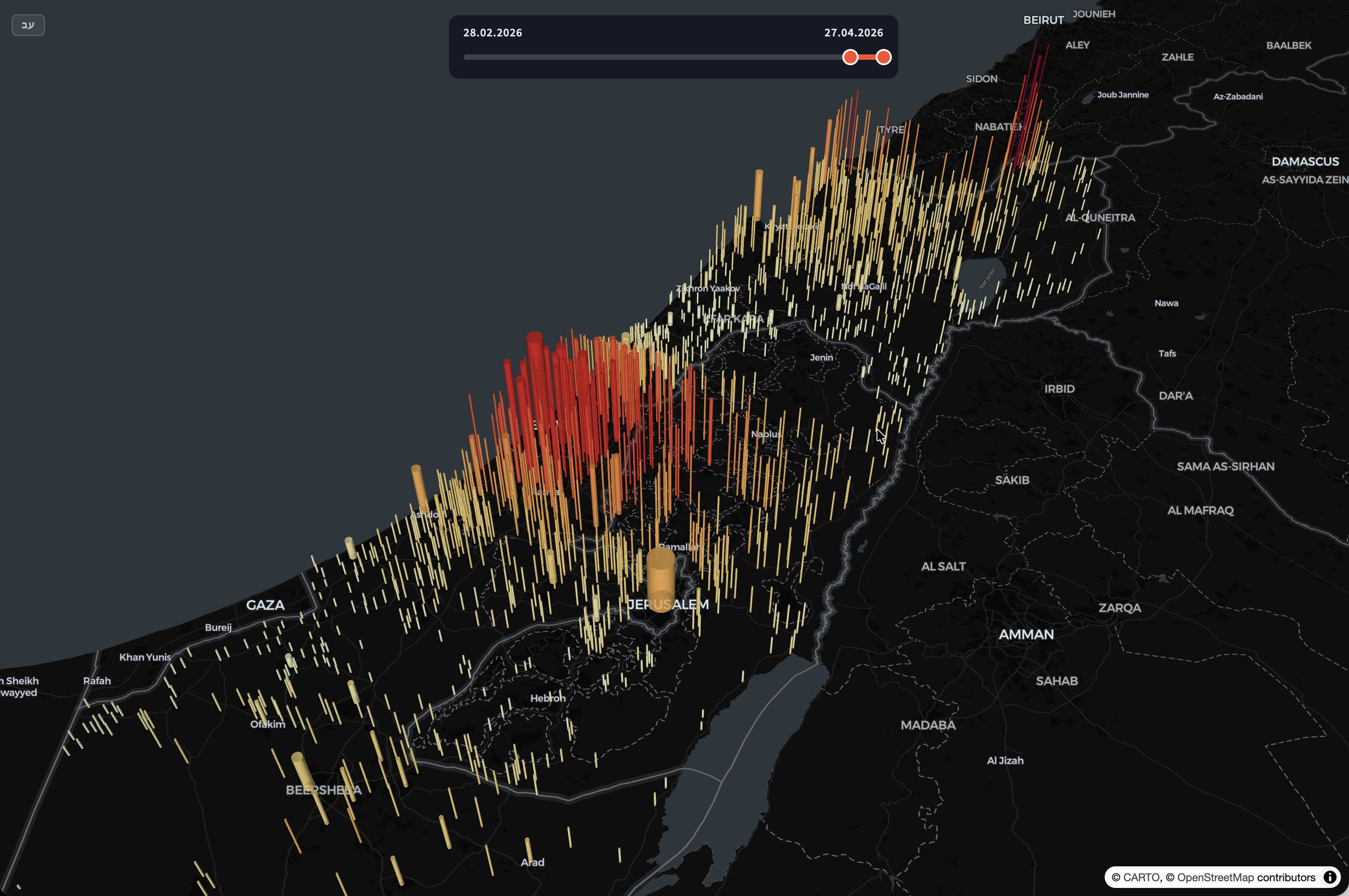
Lion’s Roar: Spatial aggregation of Red Alert events per location. Showing high concentration of red alerts as bar-height as well as color. The bar radius indicates the population size.
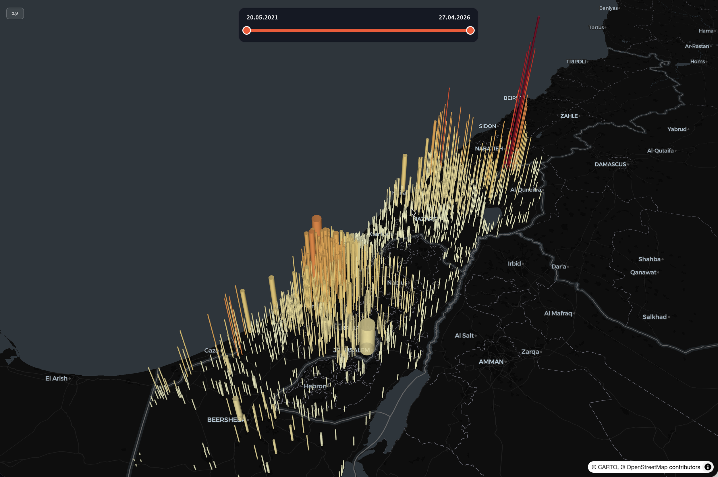
Last 5 years: Spatial aggregation of Red Alert events per location. Showing high concentration of red alerts as bar-height as well as color. The bar radius indicates the population size.
Rocket Alerts Data Source and Processing
The visualization is based on publicly available historical alert data from Tzeva Adom (https://www.tzevaadom.co.il/static/historical/all.json). The raw dataset contains timestamped alert entries associated with affected localities.
The data was programmatically downloaded, normalized, and reorganized into a structured daily format optimized for client-side visualization. Alerts are aggregated per locality per day to enable efficient temporal exploration via the date slider.
City and locality names were cleaned and standardized to ensure consistency. Population data was integrated separately and linked to each locality, enabling proportional symbol scaling and exposure analysis.
In addition to daily alert frequency, the system now computes a daily exposure metric, including:
Total number of alerts nationwide
Number of localities with at least one alert
Total population residing in localities where at least one alert occurred
No raw records are stored in the client bundle — only normalized, compact daily aggregates are used to reduce payload size and improve performance.
Geospatial Rendering
The map is rendered using MapLibre GL with a dark basemap to reduce visual noise and emphasize alert markers. Localities are displayed as proportional circles:
Position: Geographic centroid of the locality
Color: Alert frequency on selected date (sequential red scale)
Size: Population (square-root scaled to preserve visual balance)
Major metropolitan areas consisting of multiple administrative districts are aggregated into a single representation to avoid double counting and visual clutter.
The color scale encodes frequency rather than severity, using perceptually ordered shades to maintain interpretability under dense conditions.
Temporal Interaction
A custom time slider allows the user to navigate historical dates. The system loads only the selected day’s aggregated data into memory, ensuring smooth interaction even across large time ranges.
Date navigation uses precomputed daily JSON files, avoiding runtime aggregation. This enables:
Fast transitions between days
Minimal computational overhead in the browser
Scalability for additional years of data
Design Considerations
The design intentionally avoids animation effects, alarmist language, or emotional framing. The goal is clarity and neutrality.
A key design insight lies in the combination of alert frequency and population size.
Frequency alone shows event intensity.
Population alone shows scale.
Only when viewed together does the system reveal the broader pattern of population exposure.
This dual encoding allows users to move beyond counting events and toward understanding aggregated impact across communities.
Additional design decisions:
Dark theme to foreground signal over geography
Limited color palette to avoid exaggeration
Explicit legends for frequency, population, and exposure
Separation of event frequency (color) and population scale (size)
The visualization focuses on distribution patterns rather than individual events, emphasizing how aggregated alerts relate to population scale over time.
Architecture Overview
Data ingestion script (Node.js)
Preprocessing and normalization layer
Daily JSON export structure
Map rendering with MapLibre GL
Custom UI components for temporal control
Lightweight client-side state management
The system is designed to scale with additional data, extended date ranges, and potential integration of other contextual datasets (e.g., shelter distribution, demographic overlays, or infrastructure layers).
Purpose
This project demonstrates how structured public data can be transformed into a transparent, navigable visual interface — allowing users to independently explore geographic patterns over time.
It is an example of visual analytics applied to civic data: not to persuade, but to reveal structure through careful encoding and interaction design.